In the original OREGON, the player prepared for the journey by making five purchase decisions, and by answering one additional question: “How good a shot are you?” I wanted to provide the player with a richer and deeper set of decisions during this preparation phase, but I did not want the preparation to become overly long and tedious. In one of my earliest design documents for The Oregon Trail, I sketched out my ideas for these screens. A few of these screens were eventually dropped, but most survived to become part of the final product – with a little bit of evolution along the way. Three of these screens are profiled below:
1) How Much Money to Start With
The original OREGON did not include the concept of difficulty levels – other than choosing how good a shot you are. Because my mandate was to create a home market product, I felt that it was crucial to include distinct difficulty levels in the game. This would expand the appeal of the game, allowing people of different ages and skill levels to enjoy it. But equally important, it would dramatically add to the replayability of the game. As the player mastered each difficulty level, he could move up to the next level and still enjoy the game.
I quickly decided that there would be three difficulty levels – easy, medium, and hard. Then I began to consider the various factors that could distinguish the three levels. I quickly realized that one factor alone could make a huge difference – how much money the player started with. By relying on this single factor to produce the difficulty levels, I could completely eliminate the need to design and program three distinct versions of the game. Once I realized this, it seemed obvious that the difficulty levels should be based upon the player’s initial cash. If you start the game with a lot of money, then the game is a lot easier, but you get fewer points as a result.
Rather than directly asking “What difficulty level do you want to play?” I decided to use a more subtle approach, one that fit better with the style of the game. Therefore my first draft of the difficulty level screen was this:
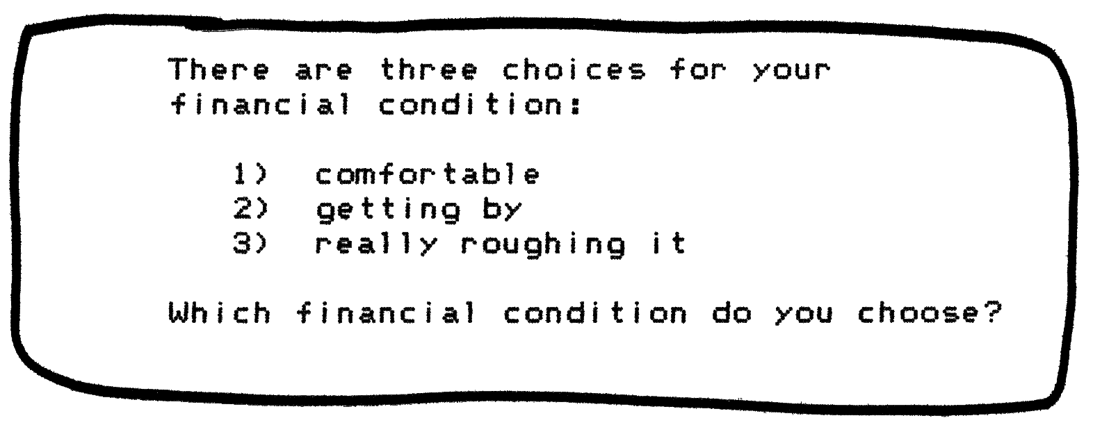
My teammates on the project liked this concept, but not the way that I worded it. One of my teammates, Shirley Keran, felt that we should express the financial levels in terms of socio-economics – that is, people from different social and economic backgrounds. I was fine with this idea, so I changed the screen accordingly. In the Alpha version of the product – the rough, early version of the game that we tested with kids halfway through the 10-month project – the screen now looked like this:
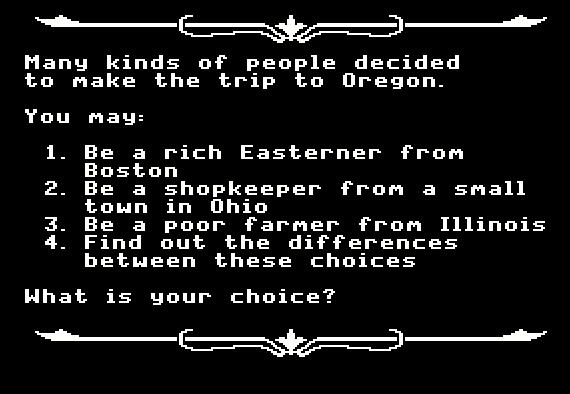
I soon decided that this screen was too wordy. To tighten it up, I limited each of the three main choices to five words, fitting comfortably on a single line. Furthermore, I changed the second choice from “shopkeeper” to “carpenter”, to avoid confusion when the player later goes shopping for supplies. In the final version of the game, the screen looked like this:
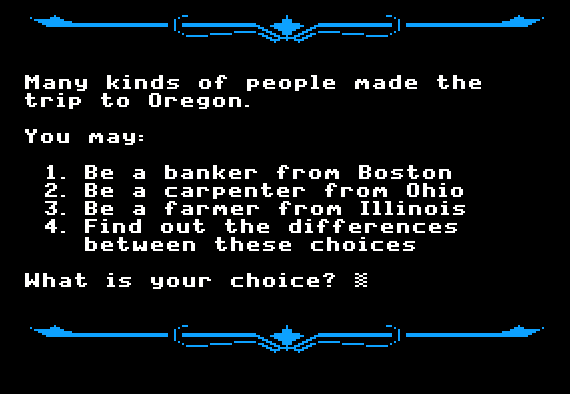
The final screen is neater and much easier to read than the Alpha version. However, because I removed the words “rich” and “poor”, it is not as clear that the sole purpose of this screen is to determine the amount of money you start with.
2) Matt and the General Store
In the earlier versions of OREGON, as the player purchases his supplies, there is no shopkeeper. Instead, the computer directly asks the player “How much do you want to spend on oxen?” In the 1980 Apple II version, the screen looked like this:
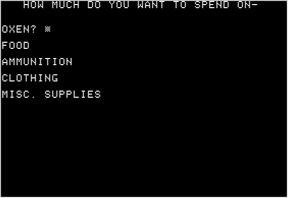
In my new design, I wanted these kinds of questions to come from characters in the game, when feasible. I also wanted to specify how much of each item the player is purchasing, not just the cash value. In early brainstorming with my teammates, we decided that the player would visit a shop called Matt’s General Store, and that Matt would personally assist with the purchase process. In my first-draft design for the purchasing sequence, I presented a set of nine screen mockups to illustrate this interaction. For example, the following mockup (in which Matt is doing the talking) shows the interaction for buying clothing:
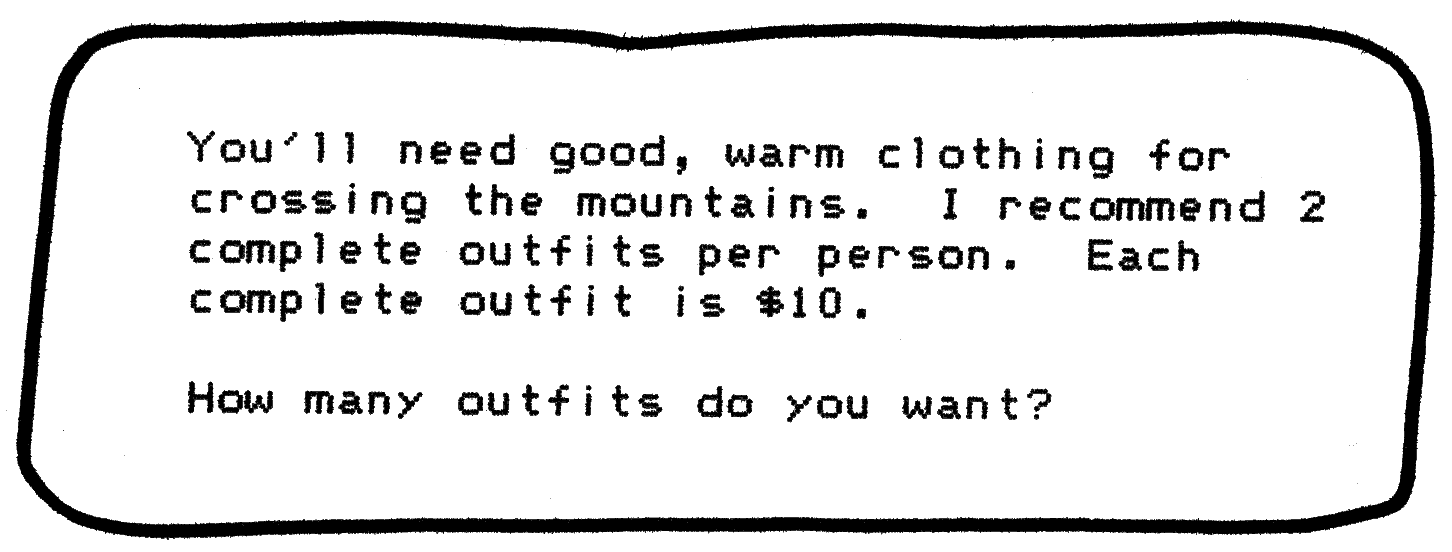
I felt that it would be too complicated to include prices for every item of clothing – including both men’s and women’s clothing. So instead I used the concept of an “outfit” – by which I meant one complete set of clothing. By the time we tested the Alpha version of the product halfway through the project, the screen had acquired some graphics, but the words remained essentially the same (but with a typo in the word order):
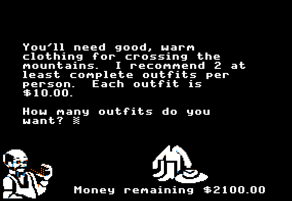
To my surprise, some of the kids at the user testing were confused by the word “outfits”. So I changed “outfits” to “sets of clothes”, which tested better. I also decided to improve several other details. I created a title to provide a context for the screen, and we moved Matt to a better location. Because the player does not actually spend the money until he leaves the store, I changed “Money remaining” to “Bill so far”. And Charolyn, our lead artist, created an improved version of the clothing graphic. The final version of the screen looked like this:

The main text in this screen is clearly based on the original mockup, and the purpose of the screen remains the same. But the evolutionary changes have made this screen a lot more interesting and usable.
3) When to Leave Independence
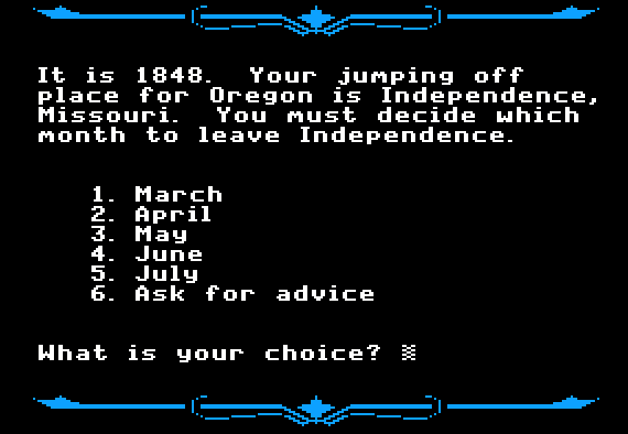
In the original OREGON, the player is not given a choice as to when to begin the journey – the trip always starts on March 31, 1847. However, for real travelers on the Oregon Trail, the question of when to start was a crucial decision. Starting too early or too late in the year would add to the danger and hardship of the journey. If the emigrant started too early, then there would still be snow on the ground, and no green grass for the livestock to eat. But if the emigrant started the journey too late, then he ran the risk of getting trapped by heavy snows while crossing the mountains later in the journey. I felt that this decision really ought to be part of the game. And therefore my early mockups included the following screen:
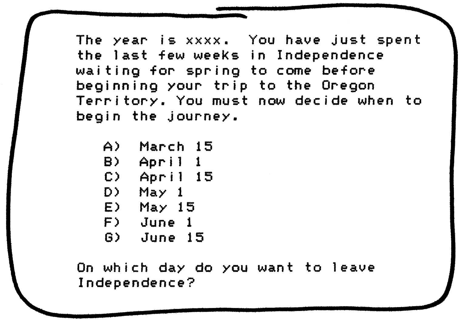
However, this screen meant that I had to design a good climate model for the product. The original OREGON did not include any climate model at all. In that game, the weather in March is no different than the weather in August or December. If I allowed the player to choose what month to begin the journey, then the climate model needed to provide appropriate weather for that month – and for every month that the player remained on the trail.
By the time that we created the Alpha version of the product for testing with kids, I had stretched out the intervals between the various start dates. Instead of half-month intervals, the choices were now exactly one month apart. This allowed me to expand the range of choices, so that the player’s journey could start as early as February 1 or as late as July 1:
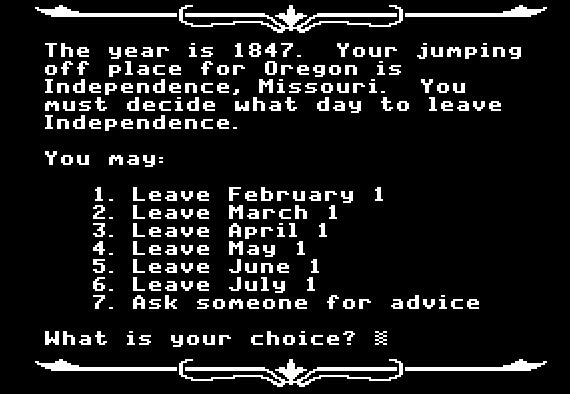
However, I soon decided that this screen was too wordy. The final version of this screen is much more concise – and it also addresses a much trickier issue. In the user tests, we found that most kids chose February 1 as the start date (the first item in the menu) which is a terrible choice that no real traveler would make. The player then begins the journey in bitterly cold weather with deep snow on the ground. The party makes very slow progress and soon dies of poor health – but the kids never understood what had happened. So I decided to limit the options to the five months that people on the real Oregon Trail might have chosen – although July (the final choice) is a dangerously late start:
